I like micro-blogging, or well, I hang out on identi.ca anyway. I'd like to use it more but I have trouble keeping track when I add interesting-but-too-prolific people on my subscription list, or I sink when the occasional flamewar/"debate" erupts in a group I follow. I don't write a lot but I read, and I wanted the reading to be more efficient. The way I read identi.ca at the moment is:
- either through the web page, trying to find back the page where I last read a notice and then coming back slowly to the first page
- or on XMPP, where if something came up while I was disconnected I can receive a huge heap of messages when coming online even though I may only have a few minutes available to read, and there's no way to mark where I stop if I only read through some of the notices.
Hm... You'd think there's a nice software announcement coming after this but there isn't really. This was the problem I set out to fix a few months ago and here I want to show how I used the wonderful Balsamiq Mockups software to wireframe my interface before jumping into the code (there is code though. You may skip to the end if that's the only thing you care about.)
Balsamiq Mockups
I've been using this for 18 months or so, and I really like it. It enables me to make on screen, in a nice readable way, something I used to scribble on paper before. The end result is something nice to look at that I can work from, and if this is software built for someone else I can show them (without any recoil of horror!) and make sure this is what they have in mind and that I'm not forgetting something glaringly obvious.
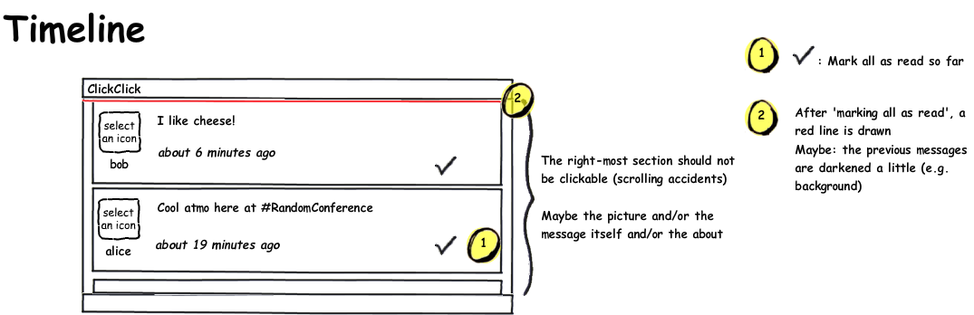
Let's go back to the micro-blogging reader. The first thing to handle was the timeline.
The first time you use Balsamiq -- after the first 5 minutes where you will be amazed and clicking eveywhere (try it, they have a web demo on their site!) -- it will take a bit of time to learn where to find what, and what widgets exist. Soon enough though, you'll be making these nice wireframes about as fast as the crappy hand drawings.
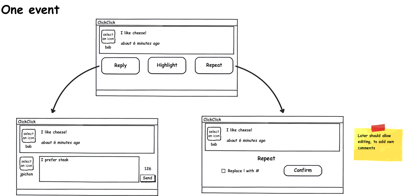
You can have several mockups open in different tabs, which is useful when working on a sequence of screens or different parts of the same project.
As hinted at on that first image, Balsamiq provides widgets both for wireframing, as well as for annotations about the wireframe itself.
Here I use fancy arrows, and a post-it note. There are other elements like the curly braces from before or the round yellow numbers, to help call attention to differents part of the design. With the different containers and widgets you can easily mock up desktop, web and mobile apps. The font and general feel of the different elements is this way -- a bit unequal, not perfect -- to remind of hand drawing and avoid giving a slick, "finished" impression. It's still easy to make radical changes at this stage of the development, so that's the kind of discussions it should encourage (also, as opposed to say a realistic HTML mock-up, the customer/user is less likely to ask if it'll be done by next week since it looks nearly ready already!)
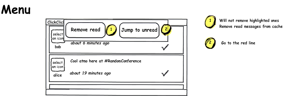
The third and last mock-up I made for the project was of the menu:
Nice and simple. Go give Balsamiq's web demo a try, you'll see how intuitive the interface is and then you'll remember it when you need it or wish for something similar. It's worth every penny ($79).
Now, what about Pinch, you ask? Well, the first attempt looked like this:
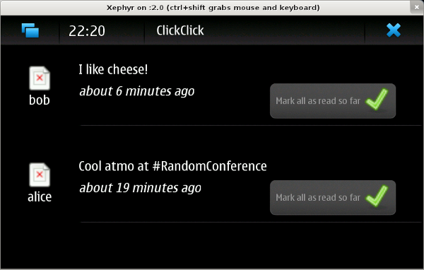
The wireframe was a very helpful guideline in remembering my goals and the big picture, to avoid getting lost in the details over and over again, though of course one should feel free to veer away when needed. On a touchscreen, a button with some text is a lot easier to click than just a small icon for instance. Also, the moving red line turned out to be a pain in the butt to figure out in pygtk so messages are simply greyed out and it's just as readable.
By the way, did anyone notice the glaring feature omission in the mockups? If not, maybe you're more of a spectator, like me...! I found out when attending an interesting talk wanting to share some good tidbit and... oops. There's no way to post a brand new message :) Ah well.
Pinch
The app ended up being named pinch due to... a thesaurus really, never mind. At the moment it's really read-only: you get your messages, you mark them as read or highlight the stuff you want to deal with later. You can remove messages you've read. No replying or writing anything though. I still consider it technically usable by other people as my name isn't hard-coded anymore, thus it's possible to set up the app for yourself ;)
The main reason development stalled is that using the app is dead slow and I'm not sure of the best way to deal with it, and I haven't made the time to research how to handle this on a phone. There's a lot of waiting around looking at nothing while the app needs to grab URLs from identi.ca and parse the XML. There are still a lot of interesting problems to solve (and I still need a nice reader-optimised micro-blogging tool dammit), so I should get back to it eventually.
In the spirit of the Myth of the Genius Programmer talk and other people saying the shame of sharing code goes away after a while, I decided to open up my GitHub repo (or perhaps it is happening because I haven't touched the code since June and forgot how terrible, terrible it is).
Resources or tips on making performance improvements for pygtk and/or Maemo apps would be so very welcome, if anyone has recommendations? :)